Avascope
Avascope – Shaping the Future of Online Fashion
The future of online fashion retail, guarantees ‘your perfect look and fit everytime’.
Right from the start, this was a bold and technically tricky project. The aim was to let people try on clothes in their browser on any device. With a small team, I had to take on several roles, leading both the visual design and the user experience to help bring the idea to life.
Services:
Lead UX, Creative lead
The problem
Clothing sizes are not consistent between brands, which makes online shopping a bit of a gamble. You never really know if something will fit until it arrives.
Avascope set out to fix that by creating a consistent experience across devices, helping everyday shoppers, to try on clothes virtually before buying.
The process of discovery
The first prototype got a lot of attention and helped secure initial funding. We then moved into user testing to find out what was working and what needed improving, based on feedback from a wide range of users.
Sketches and user flows were quickly turned into working prototypes, which we tested again to check if the new ideas made sense. Once users and the business were happy with the direction, we moved into production with regular check-ins every two weeks to review both the design and the user experience.
The solution
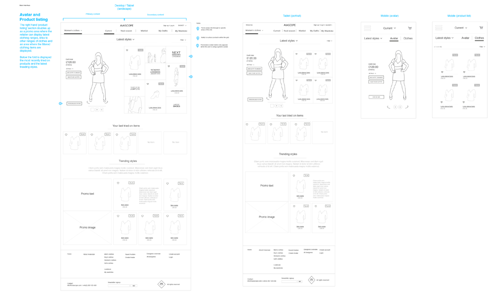
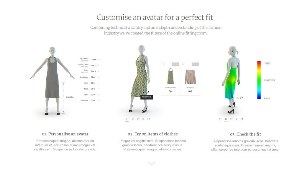
We gave the brand and user experience a full refresh, putting the fit of the clothes front and centre. The avatar stayed in a fixed position across different browsing screens so users could try on clothes, mix and match outfits and save their favourites without losing sight of how things looked.
The colour scheme was kept simple, mostly black and white, to keep things clear and easy to read. Accent colours were used sparingly to highlight key actions and build brand recognition.
User testing
Four rounds of user testing sessions were completed over a three-week period on the original prototype to establish where the main problems lay and where to focus our attention when rethinking the UI and interactions.
The above results from the rounds of user testing were presented back to the client using visual clues to show whether a user had:
01. Completed the task (green smiley face),
02. Completed the task with prompting (confused orange face),
03. Failed to complete the task (red sad face)
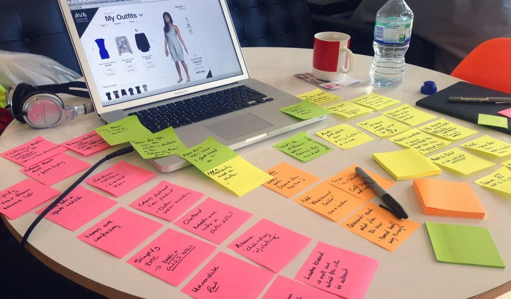
This helped us focus on what needed fixing. We pulled together all the feedback into a clear set of recommendations covering:
Layout and navigation
Colours and typography
Icons and labels
Product listings and detail pages
Avatar interactions
Changing room and outfit features
This gave us a solid base to rethink the interface and content structure.
Wading through the feedback template by template and testing out a few ideas helped form a solid foundation on which to base the new concepts for navigation and content hierarchy.
The brand
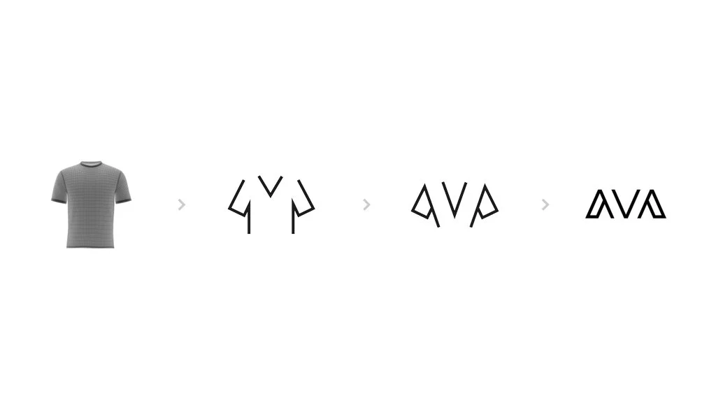
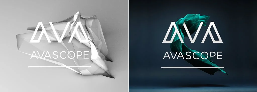
The final logo was built from angular shapes found in a t-shirt, tying in with the 3D polygons used in the clothing previews. It was designed to work well with a range of 3D styles, from sharp and stylised to soft and flowing, depending on the fabric visualisation.
Looking at how the brand works with various styles of 3d assets from angular and stylised forms to fluid forms created by the dynamic cloth visualisation.
The landing page
Animation of the Avascope landing screen to show the developers how the various elements should animate, detailing the hover states of the left and right portions of the screen and easing in and out of the animations.
The outcome
The final designs were well received by users and stakeholders. After positive feedback from retailers, the concepts were used to pitch for second-round funding which was successfully secured.

